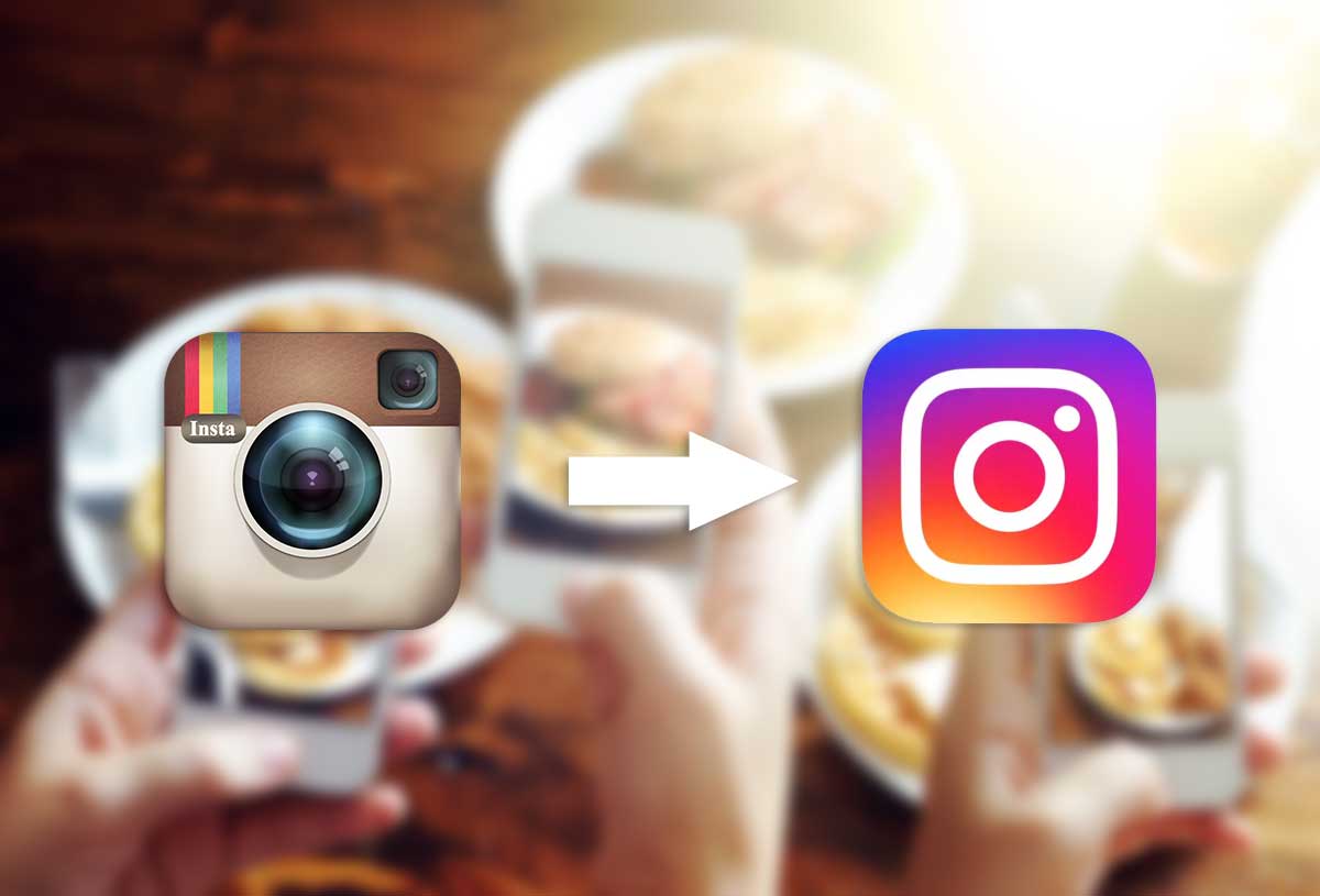
On Wednesday, May 9th, Instagram users woke up to a surprise: the company’s skeuomorphic icon now resembled the bright gradient color of Apple’s other photo-sharing apps. The new logo featured a rounded-square (the camera) with a simple dot against a multi-colored neon rainbow background. The former logo had the iconic retro-looking camera, which had become a cultural icon within the photography community. It’s no surprise that the former logo lasted five years – since the app launched – due to its popularity.
The new and more colorful redesign has already gathered millions of colorful opinions across the web. The announcement arrived with a behind-the-scenes video explaining the decision for the change. Instagram is rolling out a new minimalistic look that replaced the traditional black, blue and grey color scheme. It also updated its others apps, Layout, Boomerang and Hyperlapse. Boomerang creates a looping animation, Hyperlapse lets users create time-lapse videos and Layout is for collages.
Feedback from Our Own
Instagram’s redesign is the last popular app to leave skeuomorphism since Apple abandoned the design concept back in 2013. The most vocal of all on the Internet, not surprisingly, was the design community. We asked our lead developer and designers what they thought about the app’s new logo. Here’s what they had to say.
“The new logo seems to be an attempt to move with current design trends in mobile and web technology. The original logo seemed to be a more realistic representation of a camera, and I thought that this made it unique,” our lead developer, Cesar Gonzalez, said. “With this new logo, they’re emulating an iOS style. I’m not sure if this is an improvement over the “charm” of their previous one.”
Our designers had something to say as well, especially Jaime Villagomez who believes the change is the first thing to signal Apple’s power shift from Instagram. “Every time I’ve been involved with a new client, the first thing I want to do is update or change the logo. A little bit of it is ego, but a lot of it has to do with creating a vibe of starting over fresh.”
Jamie Villagomez expressed the same sentiment most have over on social media; no one was asking for change. He believes the logo should have remained the same. “With a new leader always comes a new image. But this logo did not need to be changed. No one was saying, ‘Man, I really want to use Instagram, but I can’t stand their logo and what it stands for.’ Some people are going to like it and some aren’t.”
It’s What’s on the Inside that Matters
While with marketing it’s always important to embrace change, we as individuals have a harder time letting go of things we’re fond of. We form relationships with objects, toys, songs, brands and logos. Brand marketers are always evolving digital media for digital devices and applications consumers are constantly using. That includes apps we’re fond of.
And just like with relationships, we need a heads up when a big change is coming.
In marketing, rebranding is always a tricky situation. If the company is actually changing services, practices or how they interact with consumers, then a logo change is acceptable. But in this case, there weren’t any drastic changes. Instagram’s core and popular features are still left untouched. The cute and retro-camera-looking app seems to stand firm on who it was before Apple bought it.
Jaime Villagomez thinks subtle changes might have been the way to go, but Instagram’s drastic change ruffled more than a few feathers.
“If we took time to look at other major social media logos, icons or designs, we’ll notice a very simple yet effective trend. They stick to one color when they brand themselves. Facebook has that cool blue. Twitter has that very soft blue. SnapChat has yellow. YouTube has red. Vine has a very energetic green.”
Jaime Villagomez also explains how color trends are very noticeable when combined with their respective logos. He believes omitting the simple trademark color was a bad idea, especially now that it’s paired with four new colors that contributed nothing before to it’s brand equity.
“All simple one-color trends are very noticeable when combined with their respective logo shapes, and sometimes these colors are noticeable alone. Instagram decided to go with a blend of three or four very bright colors. A bad move in my opinion.”
Jaime Villagomez further delves into his design process by embracing a trademark color and avoiding the chance of bringing up an association with something entirely different.
“If I was given the task of creating the new logo, I would have gone with a simple color like orange. My goal as a designer would be to get people to think of Instagram whenever they see the color orange. Seriously, the new logo makes me think of those colorful My Little Pony characters. I don’t get it.”
The outrage felt across social media also gives us a glimpse into digital marketing consumer trends. People want to be part of an inclusive brand, one that asks for feedback before making a drastic change. These applications are, for some of us, part of our everyday lives; a redesign without warning can come as a surprise.
Branding You for Success
As you can see, our team takes brands and logos seriously. For newly established or young businesses, a brand is the perfect opportunity to make a name for themselves in their market. As a digital marketing agency, we understand how first impressions can mean everything. Get in touch with us to learn more about how we can help create a campaign that will brand you for success.
.jpg)